CASE STUDY
University at Buffalo Web Management
Developing an enterprise-wide interface
In 2009, the University at Buffalo (UB) embarked on a total transformation of their web strategy and content management. As lead interface designer on this project, I researched, audited, and designed a component library and template system that could facilitate their 200+ departments.
Phase 1: Auditing existing UI constructs
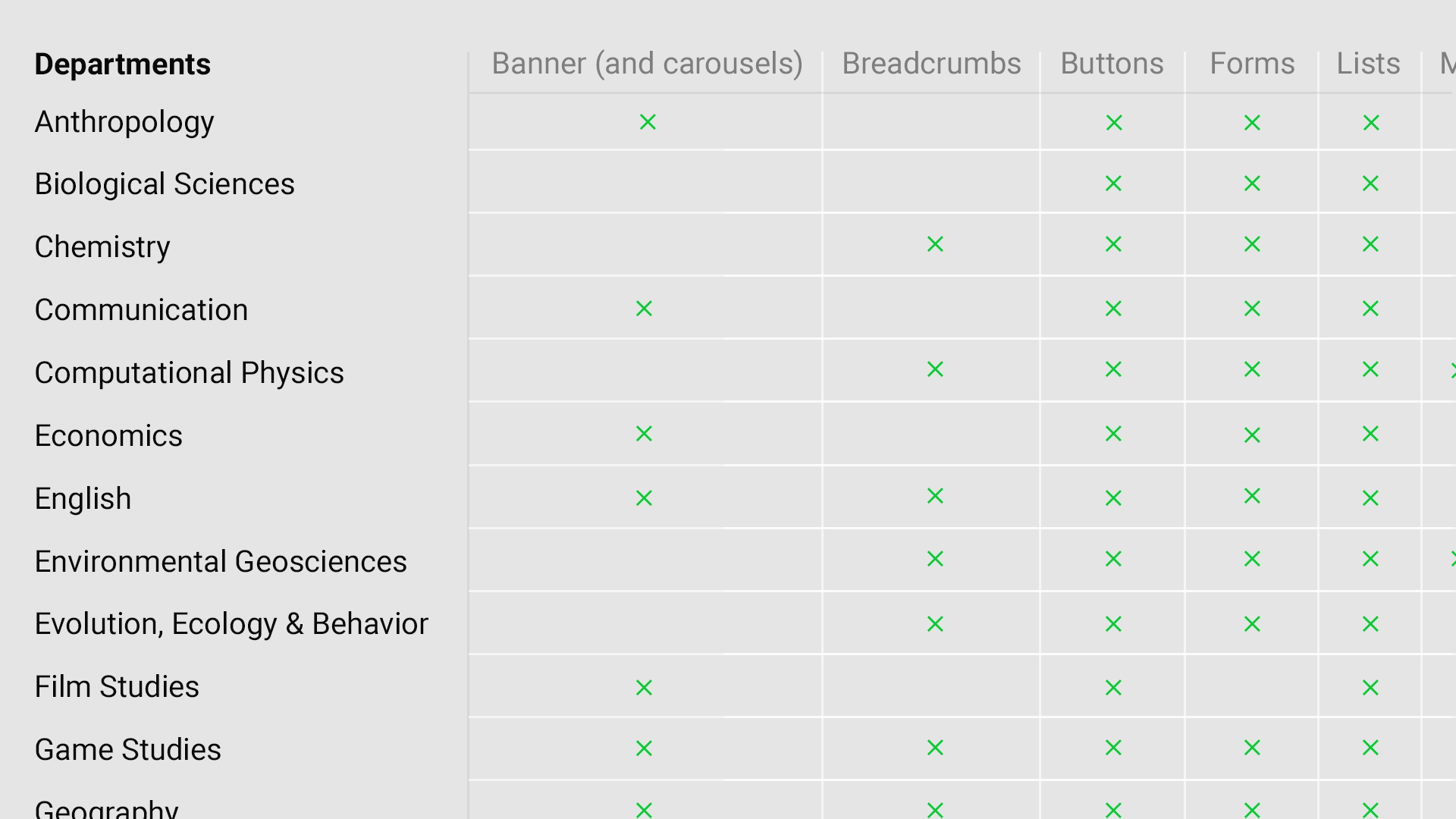
Back before the major design systems such as Twitter’s Bootstrap or Google’s Material had broken down interface into it’s basic components, I needed to find a way to identify all of the UI elements I would need to create a viable design system at scale.
Using a simple spreadsheet, I went through each of the universities websites, starting from the top level buffalo.edu down to research labs and student portals, cataloging all the constructs and building a profile of the most common among them. I also looked at a number of competitor sites to both validate the internal findings and to identify new or different design patterns.
This practice not only provided an inventory of constructs but also intuited a general guide for which constructs we may want to prioritize based on occurrence.
Phase 2: Understanding institutional relationships
In order to accommodate the established hierarchies that are present at any large scale institution, I also cataloged an outline of parent-child relationships that would need to be represented for the user to quickly identify where they were at within the greater context of the university’s online eco-system.
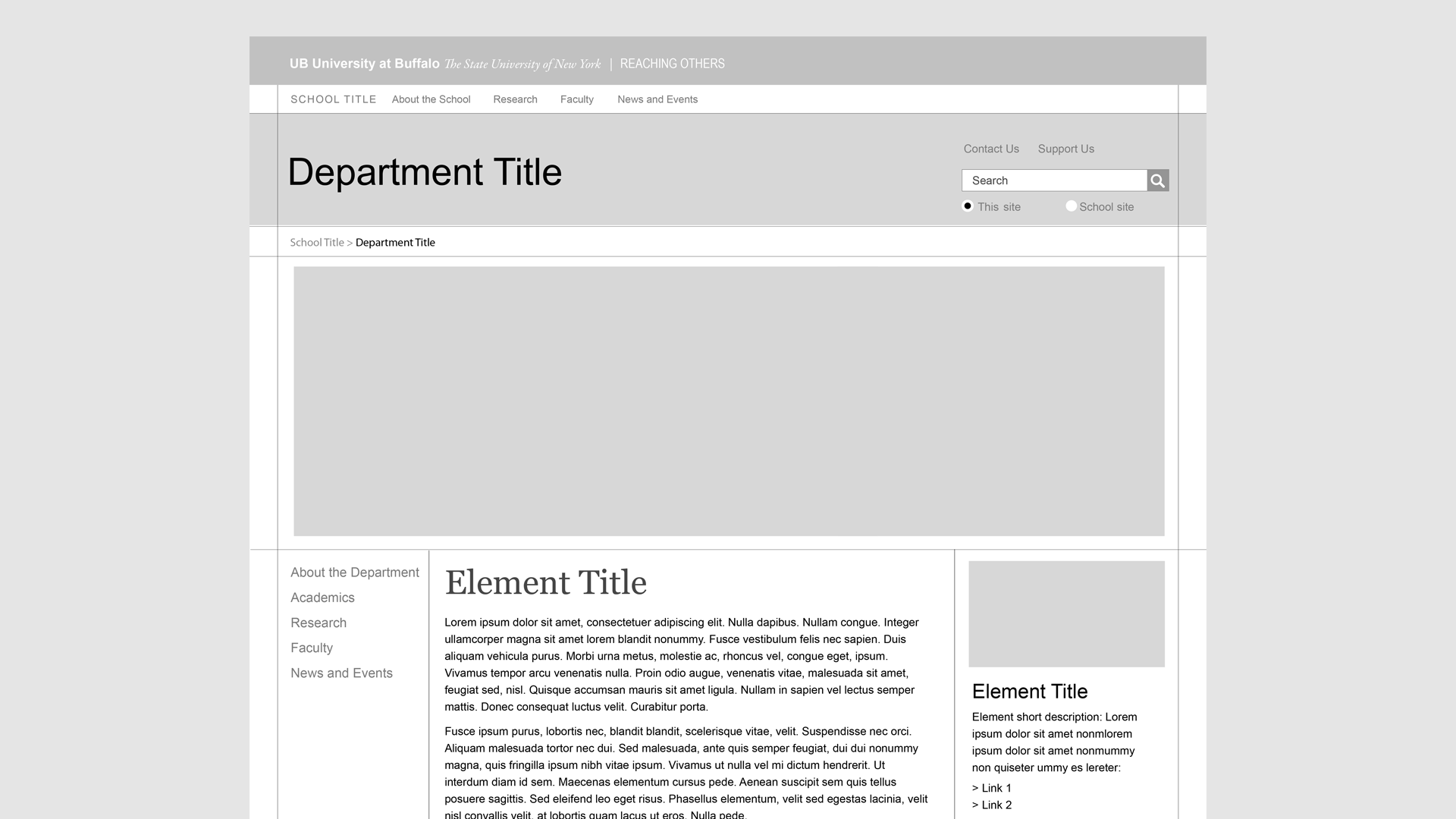
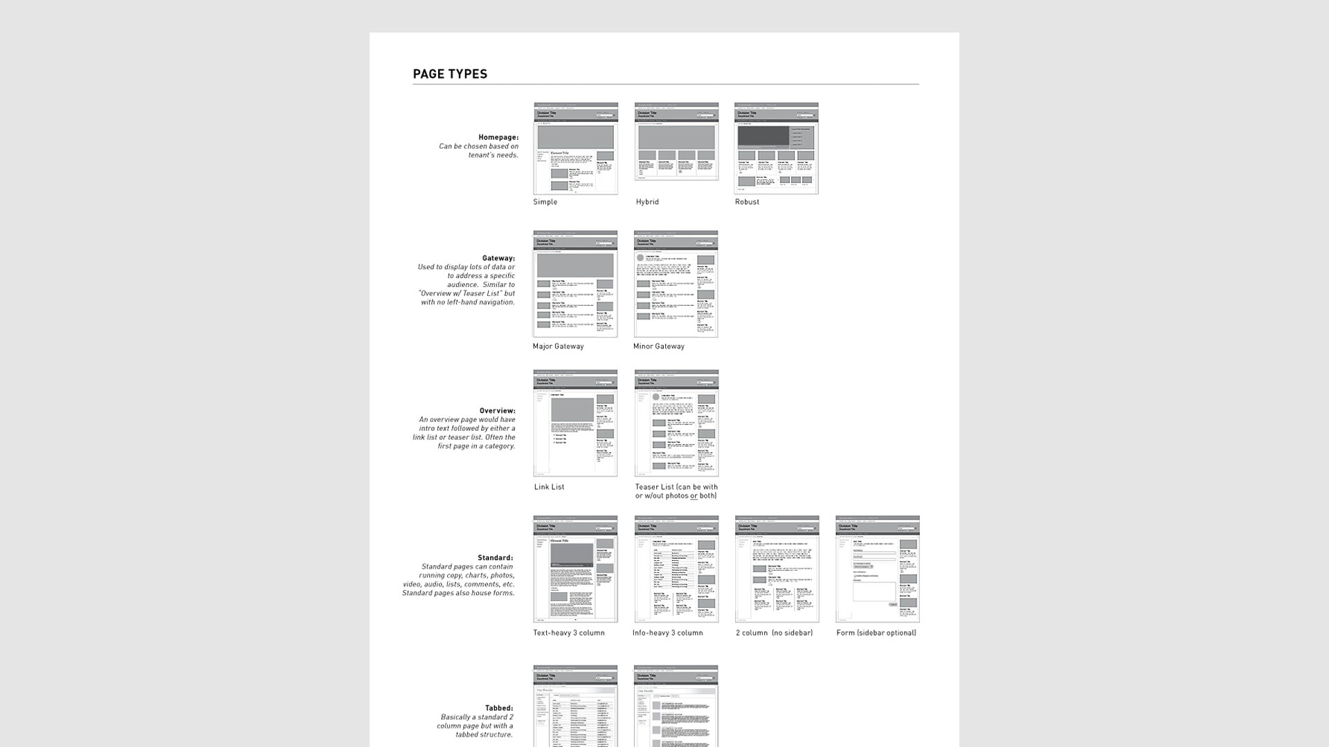
Phase 3: Wireframing for flexibility
Once the analysis of both constructs and relationships was established, I set out to integrate the constructs into flexible page templates. Using an approach that went wide rather than deep, I focused on types of pages (e.g. home pages, article pages, gallery pages, etc.) instead of specific content.
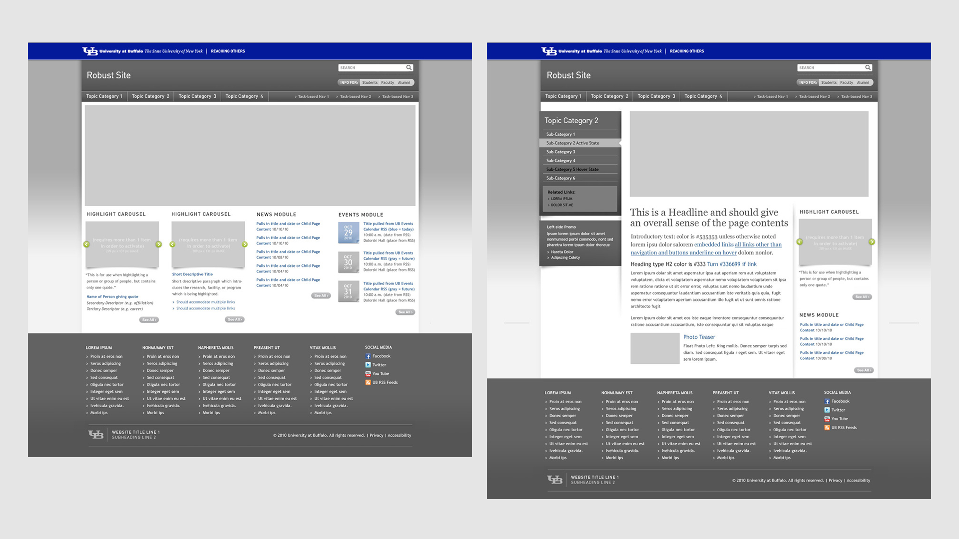
Phase 4: Developing the graphic interface
With proof of scale occurring at the wireframe stage, this phase of the project saw the hard work of defining and applying fonts, colors, and behaviors – all in accordance with strict ADA guidelines.
As the designs were ready, specs were written, and annotated PDFs of the behaviors were handed off to the developers for coding.
Phase 5: Going live
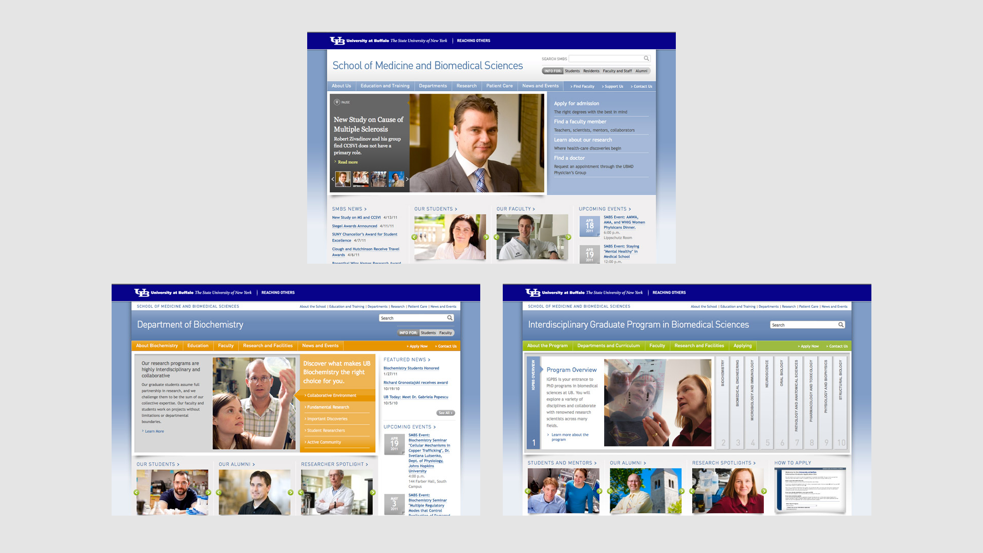
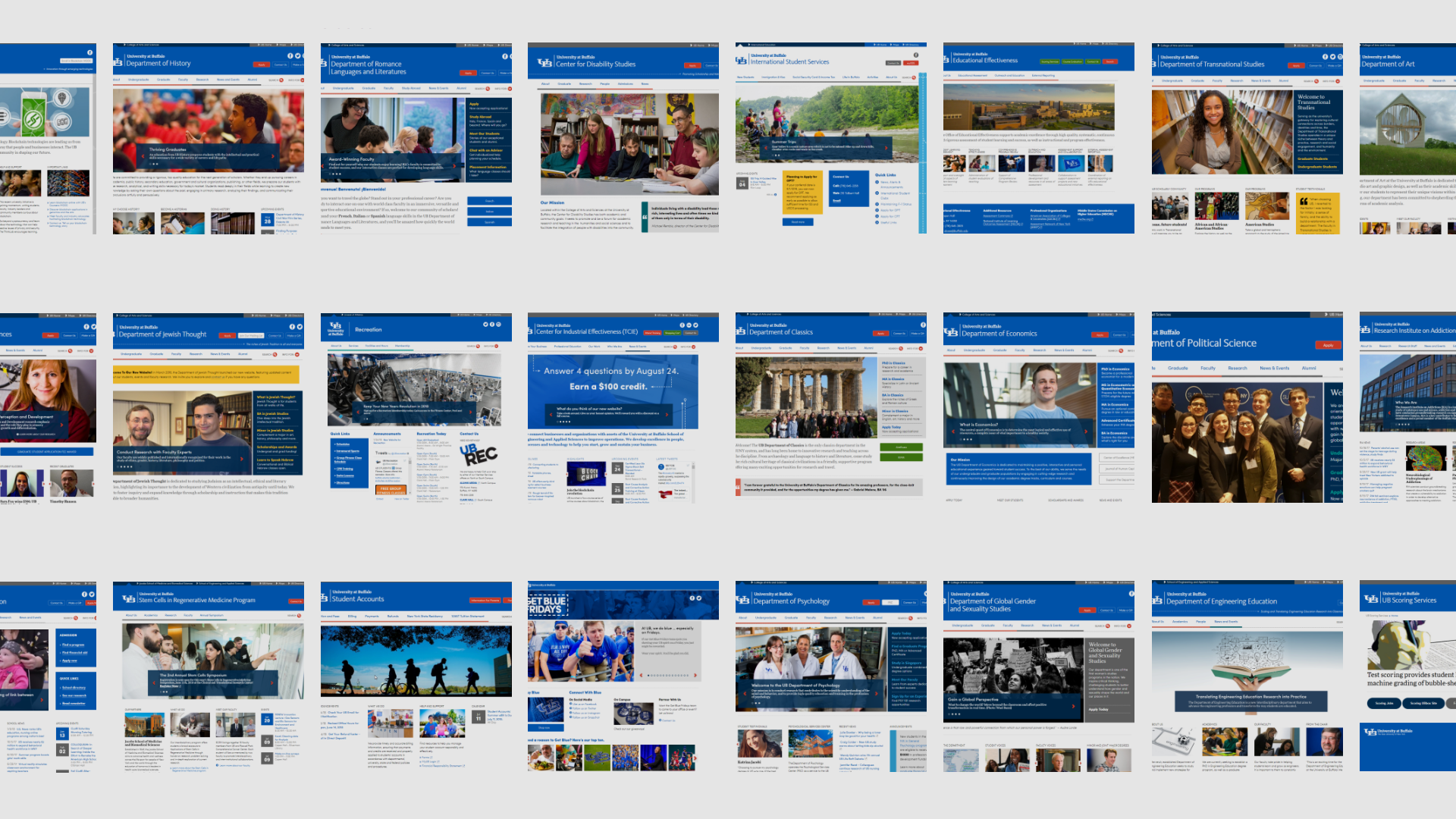
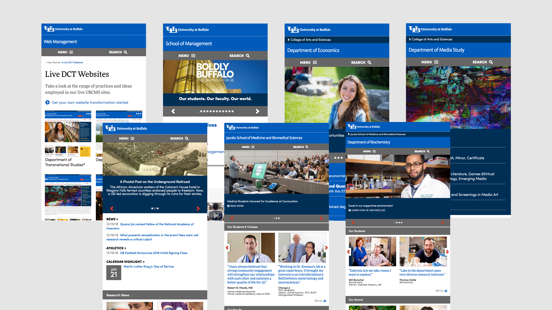
Once the coding of the components and page templates were done, they were first applied to the UB’s School of Medicine and Biomedical Sciences as a proof of concept. Chosen for its importance, visibility, and its large organizational structure, the site would become a model for the success of the project. Ultimately creating a standardized web eco-system which strengthened their brand while saving on maintenance and bringing in millions to the university in prospective enrollment.
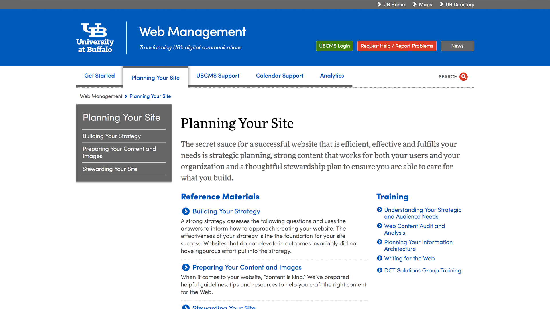
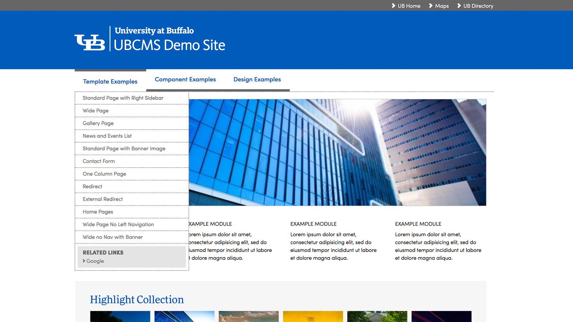
Documentation and demos
Designed as an enterprise web management system, it was important to have good documentation and working examples that could help onboard initial users, as well as to help evangelize the system to university faculty and staff. To do so, two sites were developed – one to facilitate learning about the process and one for learning about the tool.
Making it all mobile
At the time of this project (2009), the idea of augmenting a site’s markup in order to display on multiple devices was just gaining strength. Through some clever thinking, we managed to use media-queries and JavaScript to present cross-device versions of this same code base in order to facilitate phones and tablets. Surprisingly (I’m sorta surprised anyway), the approach we implemented is still being used to this day.
A note on the CMS
Usability testing the system…and the system behind the system
While the above case study primarily addresses how the constructs and templates were arrived at, there’s also an interesting journey that took place in the selection of the content management system (CMS) which we used to facilitate the front-end display. While this could be it’s own case study, I felt I didn’t have enough of the original documentation to warrant it.
Early in the planning phases of this project, I was tasked with identifying a functionally suitable, user-friendly content management system. This was the early days of these applications and we needed something that was familiar to the widest audience possible.
Using Microsoft Office (because everybody knew it at the time) as a baseline for user familiarity with UI patterns, we began the selection of the CMS by:
- Identifying what we assumed to be the most common user tasks when publishing content
- Observing prospective users in their workplace, noting common publishing-based behaviors and vernacular (i.e. how did they talk about the tasks that they were doing)
- Benchmarking key functionality of existing content management systems
- Aligning the needed functionality with what was known to be available in the market and weeding out those that didn’t match up
- Inviting the remaining identified systems to the university for a demonstration and Q&A on the product
- Conducting non-directed, task based usability tests of those systems and quantifying the results
- Creating a matrix of all of the above and presenting those findings to stakeholders and leadership
- Select the CMS and negotiate the contract
And, what shook out was very interesting. Not only did we identify and select the most functionally relevant, user-friendly CMS for our particular user set, but that system, Day CQ 5, soon went on to be identified, acquired and adopted as the base for what would become Adobe’s Experience Manager software. A great validation to the work we had done…and a great value for the university in that we recognized the potential of the software and were contracted in before a significant markup.
