CASE STUDY
Zimbra Redesign
Modernizing an application for both users and developers
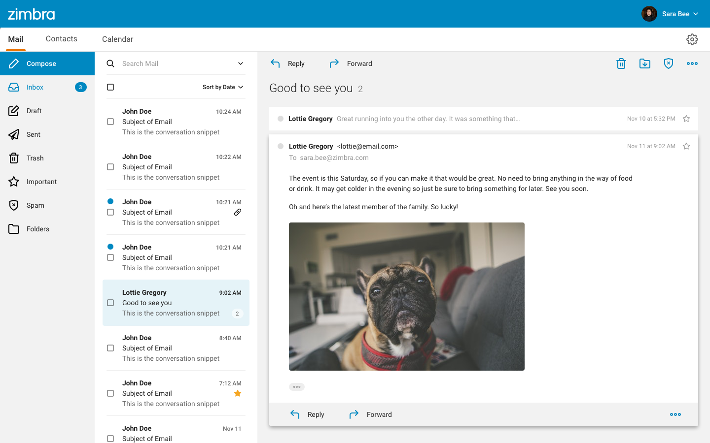
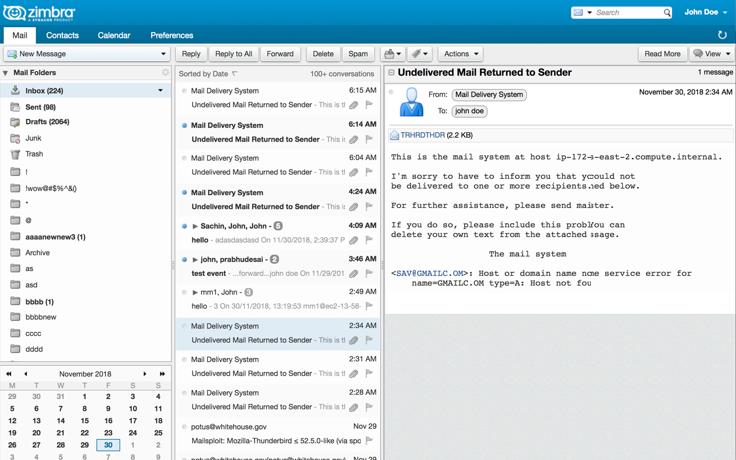
Developed in the early aughts, Zimbra – an open source communication suite with 500+ million users – was originally built with a table-based layout using Java. This posed difficulties in both accessibility and in finding new developers that were ready to jump into the codebase. In redesigning Zimbra, I had the opportunity to start with a clean slate, new APIs, new design, new system.
Updating the code base
Although I can’t claim much contribution to the actual code, UX input on the new Zimbra architecture would come in the form of understanding the business needs of existing and prospective contributors and costumers and communicating these needs to the dev team. As an open source project, the contributors (both internal and external) needed a lean, easy-to-work-with codebase that facilitated a quick build, install, and deploy process. The customers, ranging from small businesses to government entities, needed to be confident that the new product would be flexible enough in both display, and behavior to meet their various requirements.
With this understanding, the revised code would be built using React and driven by GraphQL APIs. It would also be cross-platform and cross device, relying on a universal, responsive codebase to support both native and web-based applications.
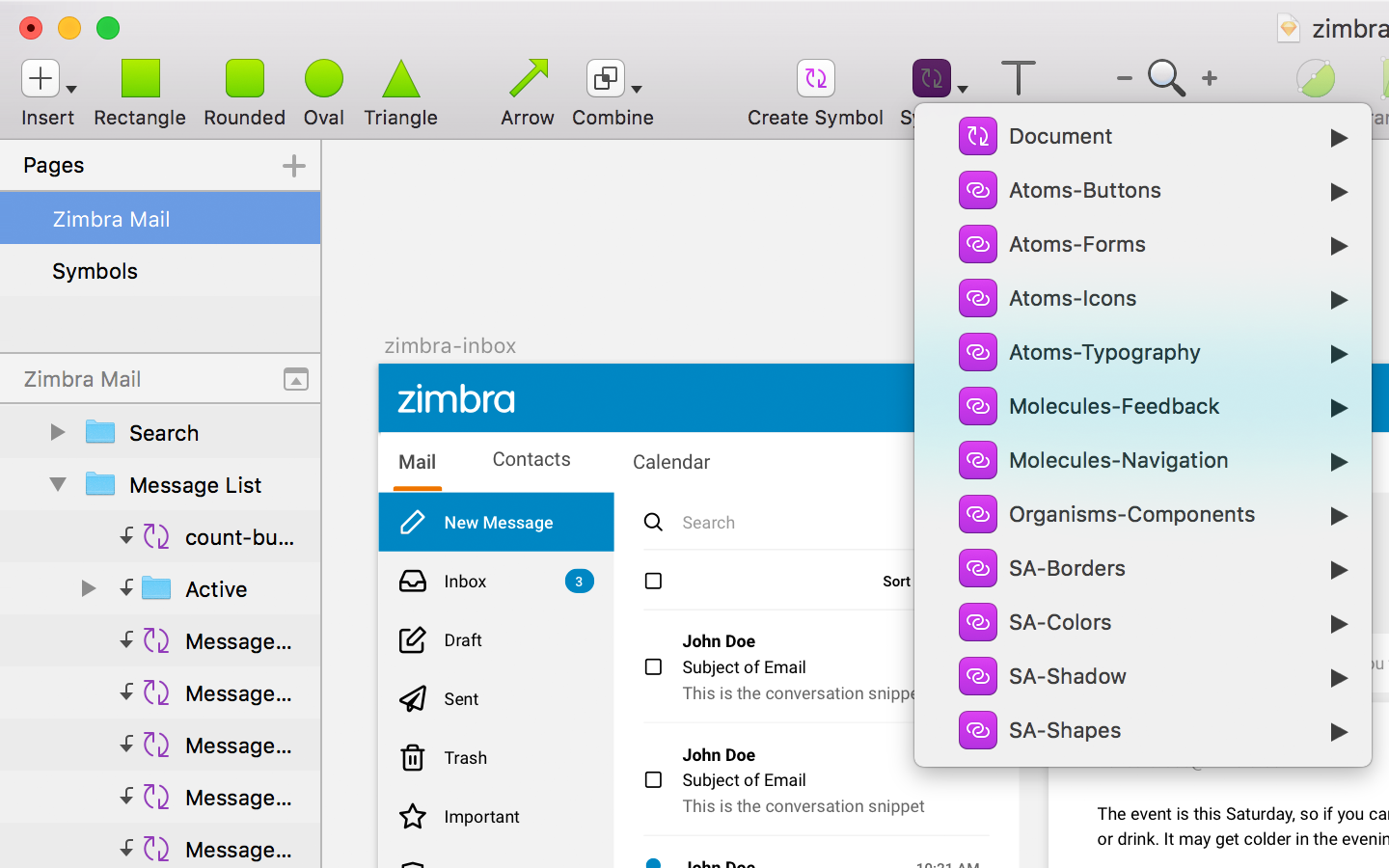
Developing the interface
Using the principles of Atomic Design, the UI would be designed from the ground up – first developing basics like buttons, inputs, and typography, then combining these elements into more complex constructs which were organized to form the basis of the application’s layout/templates.
This approach encourages code reuse and allows the developer to focus on the fidelity of an element while also allowing ease of identifying regressions down the road.
Additionally, because the focus of the development of the UI is on a system of reusable components rather than on pages that do one particular thing or another, the adding on of additional content and/or functionality is much simpler. This extensibility is crucial for an open source, white-label product such as Zimbra.
Flexing the new structure
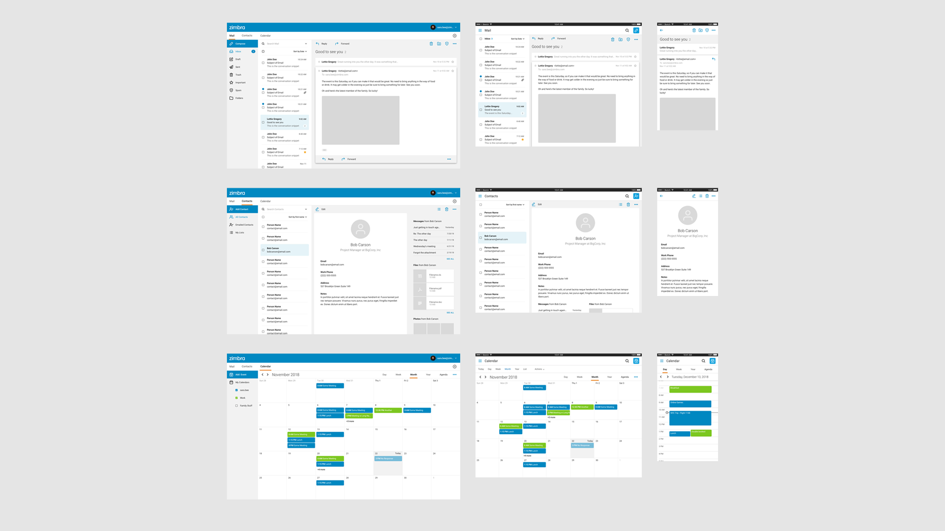
While the previous versions of Zimbra had separate codebases for the native desktop and the mobile versions of the product, the new version would work off of a single codebase and be packaged for use as a native desktop or mobile application.
Addressing needs
As a “next generation” to the legacy Zimbra application we made sure to address user voices and business needs.
Users
- “Make it modern” – Updated the look and feel to meet current sensibilities and updated the code to make it easier to change in the future.
- “Don’t change everything around” – Maintained parity with legacy functionality and general placement, while bringing forward the most used items and demoting the rest.
- “Needs to work on my phone” – Made sure to meet user expectations, across devices. Because of the wide and varied user base, this meant making sure that almost all functionality was available via responsive patterns.
- “It’s just gotta work” – This basically meant, it had to work better than the previous versions. With the simplified flexibility of GraphQL we were able to improve the functionality and fidelity, resulting in less bug tickets and quicker response time to fixes and feature requests.
Leadership and Devs
- Reduce Maintenance – the previous version of Zimbra had separate codebases which supported a web-app, desktop app and a mobile app. The new UI would be cross-platform and cross device, relying on a single codebase.
- Reduce Development Time – building the code on a React framework with a GraphQL-driven API, allows engineers to onboard and contribute quickly. Combine that with a componentized library of common UI patterns, and developers are off and running.
- Design for Scale – Through a design that gives extensibility primary importance, the Zimbra X UI is built for extensibility. From the mindful approach to an information architecture that needs to flex, to the add-ons (i.e. Zimlets) which allow for seamless integration of additional functionality.
Partners
- Design for Flexibilty – As a white label product, Zimbra X is built to accommodate a wide variety of industries – from ISPs to universities and governments. Due to this, we needed to make sure that logos, brand colors, fonts, iconography, language and reading direction can be easily adjusted to meet the needs of any customer.
- Design for Accessibility – While utilizing Universal Design principles is always a key consideration in my designs (as it helps everyone, and generally increases the product lifespan), it was particularly necessary for this project in order to fulfill the contract requirements of many of our existing and prospective partners.
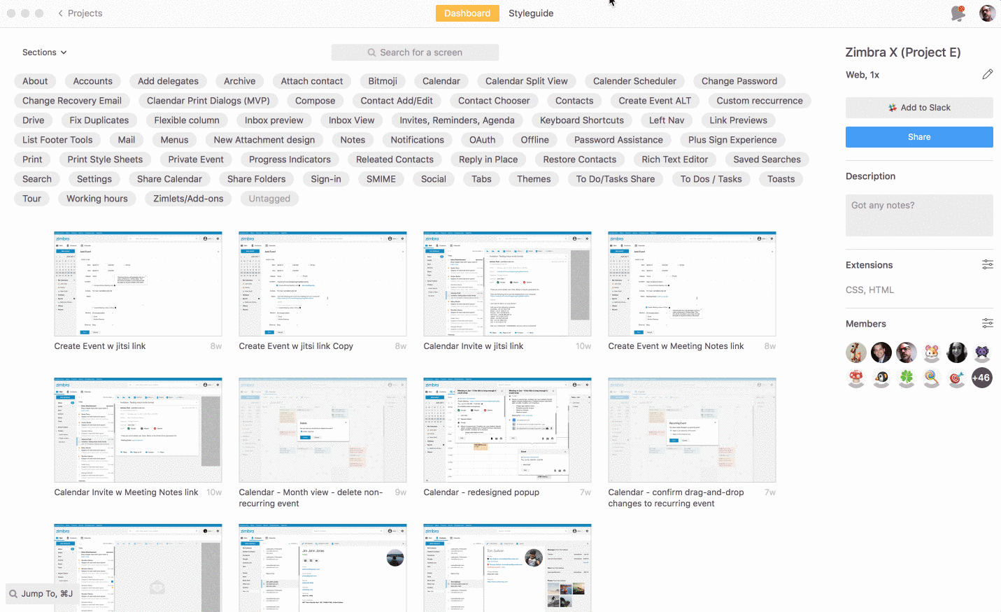
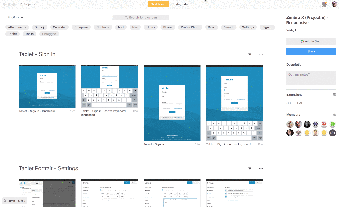
In the weeds
The above examples primarily focus on the inbox, but if you’re interested in seeing the amount of UI work that went into this project, and how using a componentized library makes sense for a project of this scale, just take a look at the below screen recordings showing 1000+ screens from the specification app Zeplin. Note, the designs differ a bit from above, but this was the earliest work, and with relying on libraries, it was a breeze to update the mocks.