CASE STUDY
Start Pages
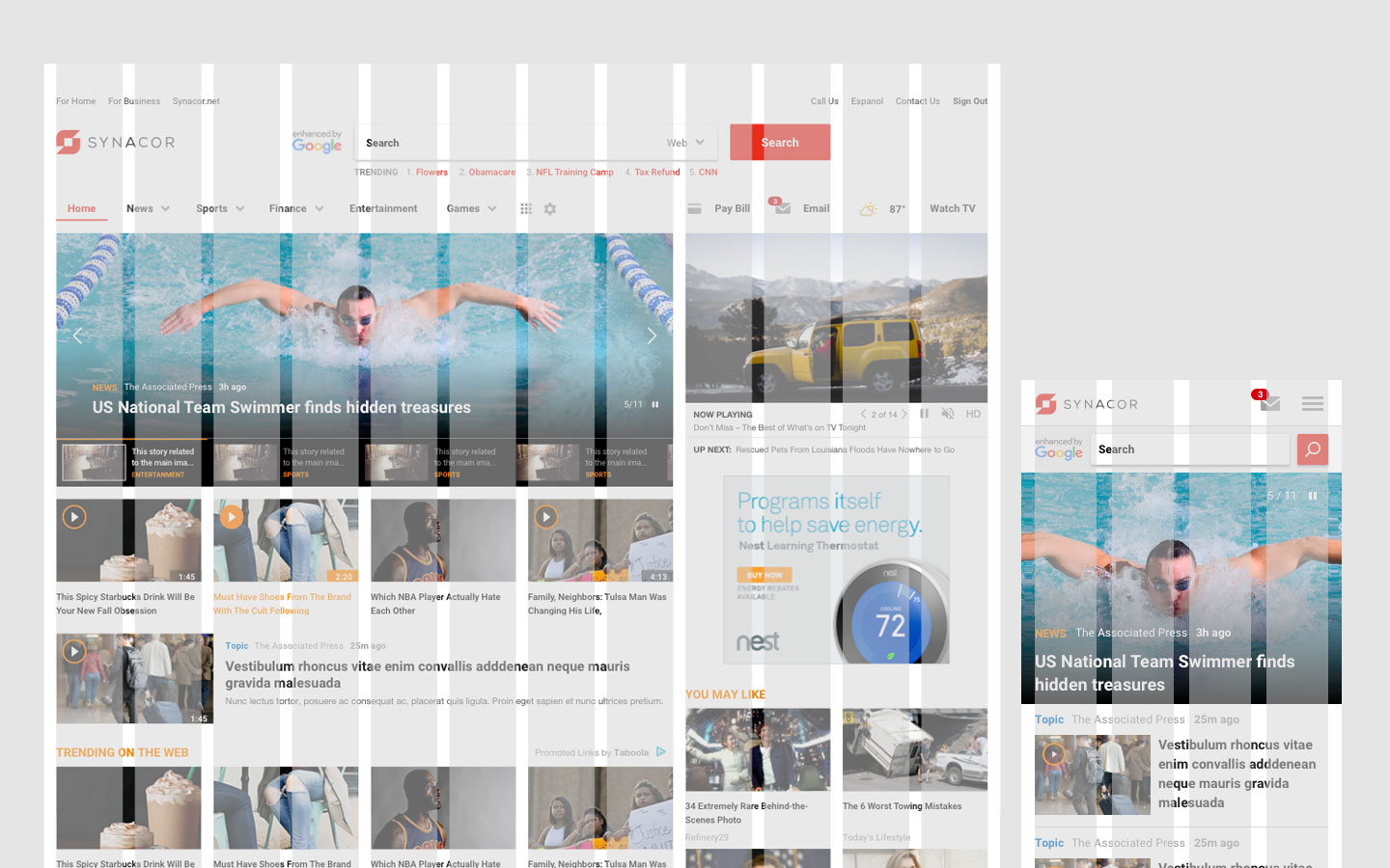
When redesigning a Start experience doesn’t get off to a good one…
As my first project at Synacor, I was excited to work on a white-label application that had to work for lots of different clients and be flexible for both users and brands. When I joined, initial designs were wrapping up and I was hired to assist the UX team and make sure they brought the product to market on time. As the front-end development started, I quickly began to identify issues with design integrity as it was translated to code and with the development flow itself. Acting on these observations, I stepped in to more of a product management role to see how I could improve the process.
Design Issues and Resolutions
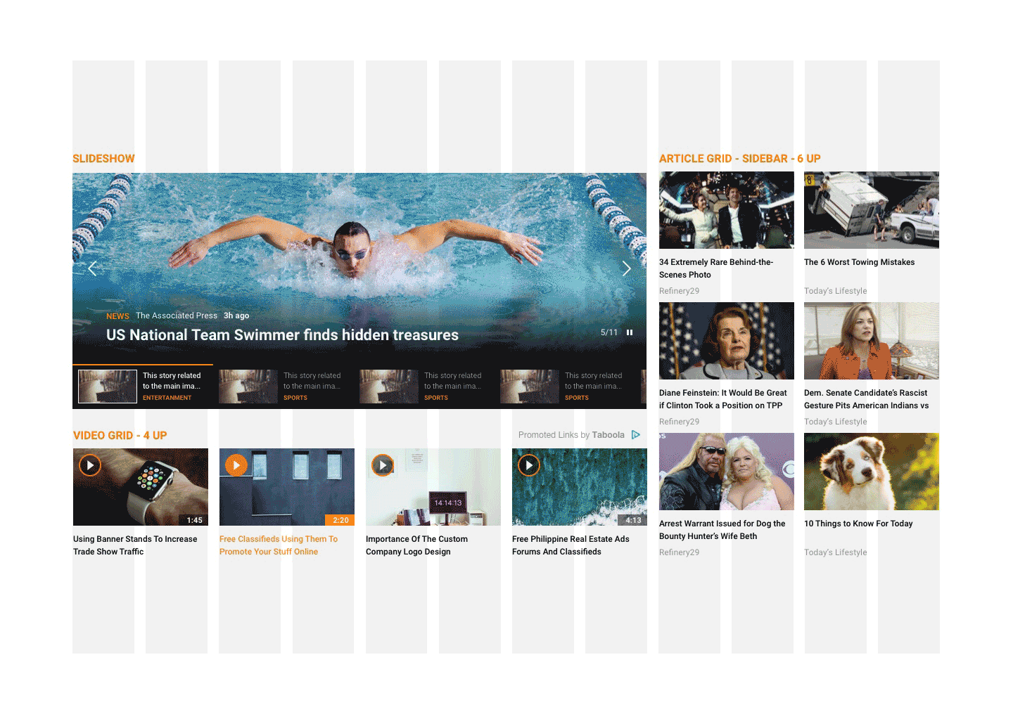
Issue: No established grid
As designs were going to the front-end engineering team, it quickly became obvious that there was a disconnect between what was in the mocks and what was being committed to code. It turned out that although the designs were well-crafted and even considered display on multiple screen sizes, that the behavior of the grid had not been defined or even discussed amongst the Product and Engineering Teams.
How a product could get this far without having a defined grid system is a bit mind-boggling, but hey, it happened and we needed to move the work forward.
Resolution: Define the grid and adjust the mocks to match
Being that the engineers had independently decided to use Bootstrap, I resolved to leverage the completed work and adjusted the grid in the mocks to match the code.
With the grid securely in place and expectations reaffirmed amongst both the designers and developers, the work could continue. Now, when checking size and spacing, the math made sense and the overall fidelity improved.
Issue: No review of the work in pre-production
From then on things went smoothly. Except they didn’t. As it turned out, there was also no established review of the work before it was in the production stage – meaning that designers weren’t checking the designs until it had been through code review and quality assurance testing. But at each of these stages the code wasn’t being checked against the design. So, although the code worked and the UI was usable, it often looked nothing like the initial mocks. Sure it seems like the engineers, particularly the QEs should have recognized the discrepancy, but as it turns out they just didn’t.
I even ran a quick user test (using non-directed techniques) with the engineers having them look at the final designs vs the mocks and more often than not, they could NOT see a difference between colors, fonts, or spacing. To them it looked all the same…or at least not dissimilar enough to warrant fixing.
Resolution: Establish a Design Review in the process
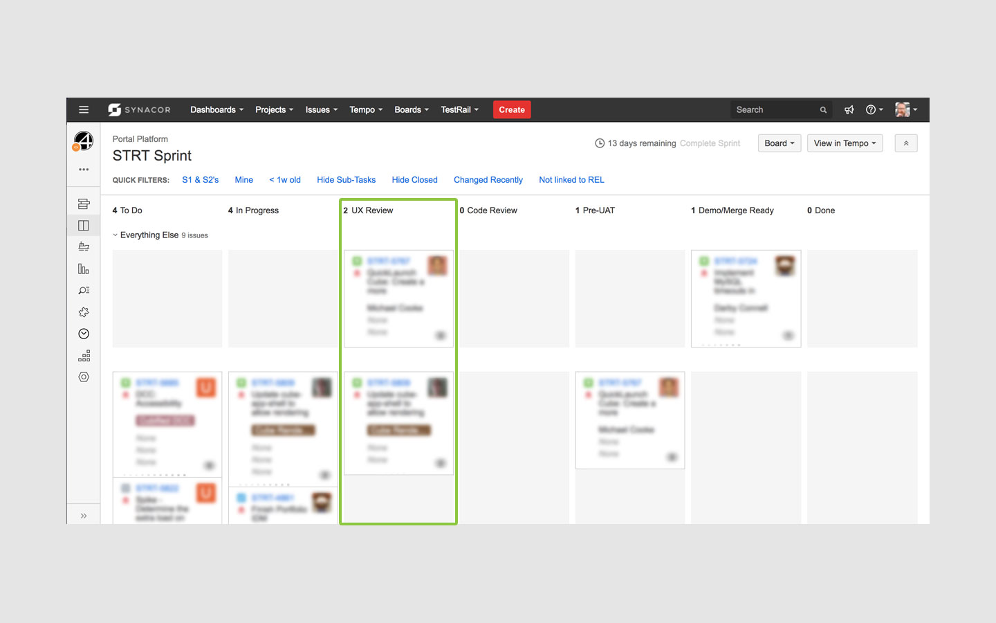
To resolve this I worked with the engineering manager to add a design review column to the dev team’s Agile board and default all newly created tickets to require this review.
It was at first thought that this extra step would cause a bottleneck in the process, but, in fact, it led to increased velocity as the guesswork between the front-end engineers and the quality engineers had been removed as the designers were now part of the conversation.
The UX Review is now a practice across all products at Synacor. It’s instantiation has increased velocity, fidelity, efficiency and improved communications across teams. Go, Synacor!
Happily, I’ve also seen some validation for this process in the industry. Jess Eddy from UX Collective has written a relatively recent article on this exact step. Although they call it, “Design QA” the basic idea is the same, “…a step in the process between development and testing…a chance for the designer to: 1. Review the coded version of the UI prior to testing; 2. Work with the developer(s) to make updates to the UI in code.“
Applying lessons learned
Since these early experiences with the Start Product, much has improved between the UX and Dev teams. These early learnings continued to inform our next steps as we developed the next generation of products.
A huge step in the right direction has been the development of a componentized approach to web development, utilizing design libraries based on an overarching design system.
For more on design system’s see my recent work on the Zimbra communication suite.
