CASE STUDY
UB’s Research Based Transformation
Transforming a university’s digital communication strategy
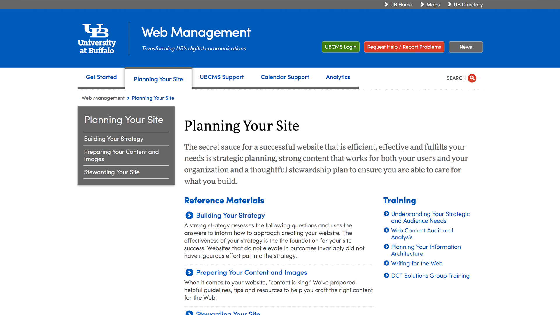
As part of the core team of the University at Buffalo’s Digital Communication Transformation I was involved with defining and instantiating a process that would serve as the model for the university’s online presence.
Working with an internal team of stakeholders and subject matter experts, alongside industry experts mStoner and Indi Young, we researched and formulated a process to understand business needs, audience needs, the available content and the content that was still needed.
My main contribution on this project was to serve as the lead interface designer and to contribute to and apply the findings from this initial research and discovery to the UI. For more on my application of these findings, you can see my case study on web management.
Planning the plan
When I first sat down to write this case study, I started off by outlining the steps of the process: auditing, modeling, info architecture, etc, but I would be remiss not to mention the book Web Redesign 2.0: Workflow that Works by the incredible team of Emily Cotler and Kelly Goto. This book, first published in 2002, was crucial in developing the timeline, creating the benchmarks and insuring the success of this project.
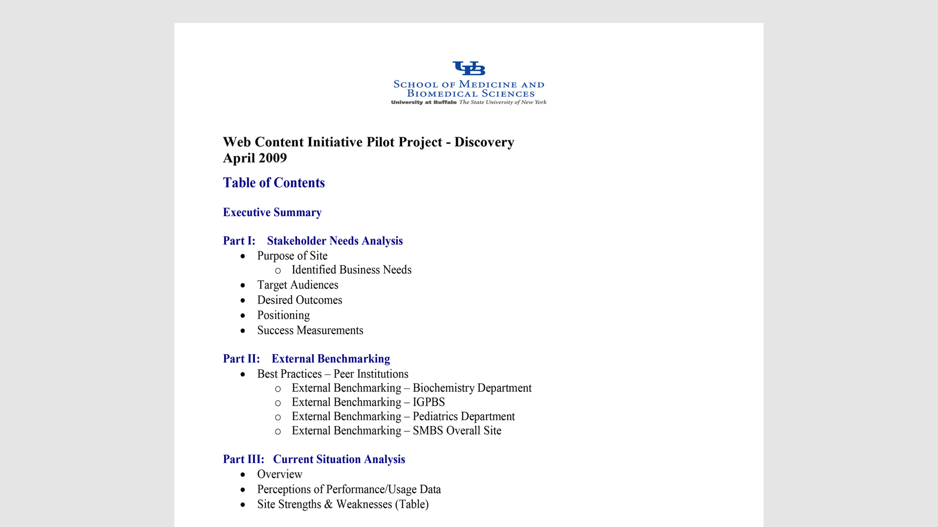
Business guidance
The business guidance portion of this process was very important in onboarding and ensuring buy-in from the key stakeholders. This allowed the organizations to create a baseline of what their business needs were and to set their own expectations. Later on in the process we would match these needs against user needs and fill the gaps (or, sometimes build the bridges) in order to satisfy both.
Content audit
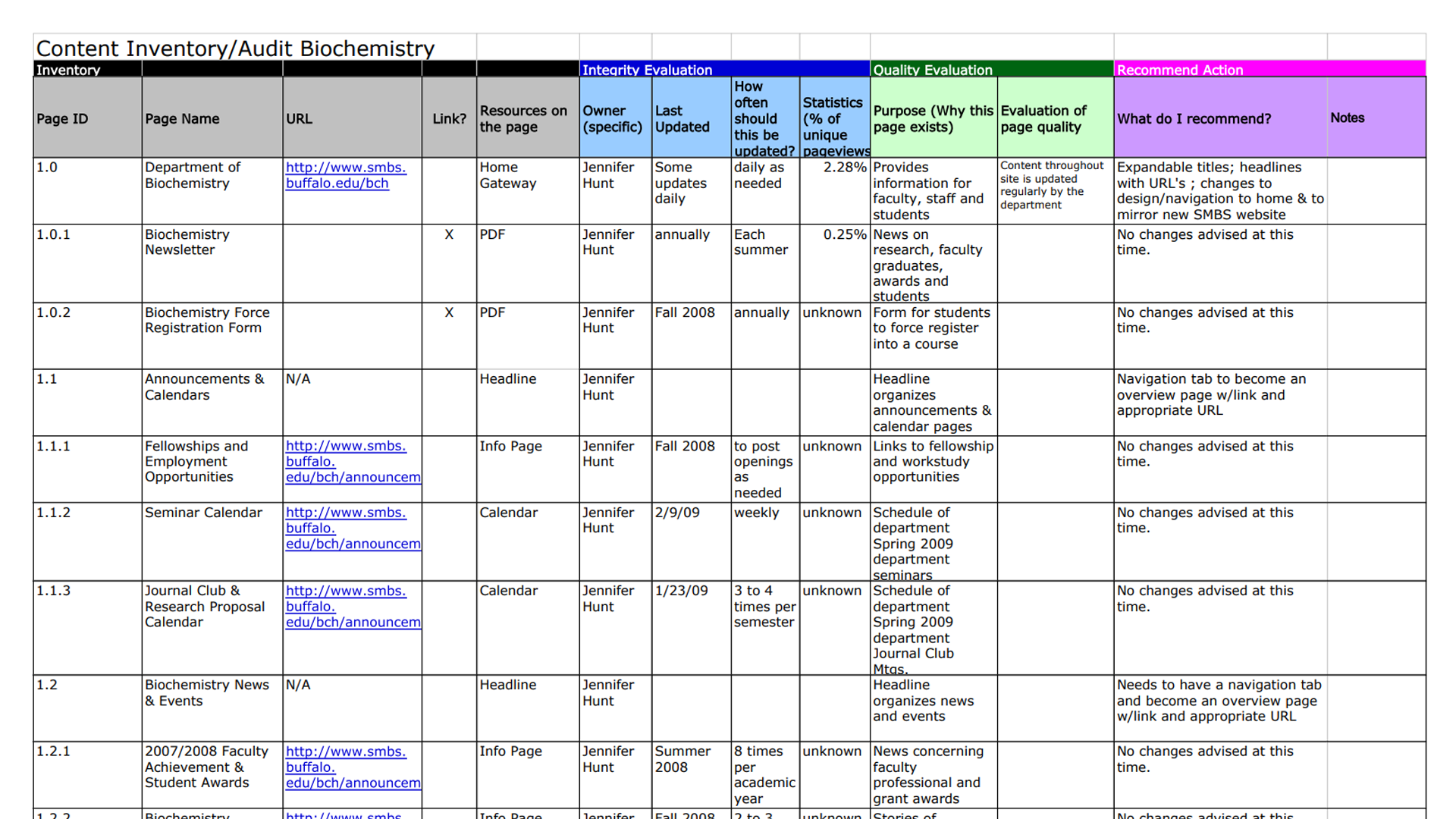
Many times when restructuring a communication, particularly when it comes to the seemingly infinite space of online communications, site owners will simply want a rewrite of the existing content. As part of our process, it was important to conduct a thorough inventory of an entire site and have the owner(s) determine an appropriate action: keep, revise, or remove.
By creating a content auditing template that kept the reviewer focused on the recommended actions of keep, revise, or remove, we were not only successful at getting the needed content, but we also validated that the content was purposeful.
Mental models
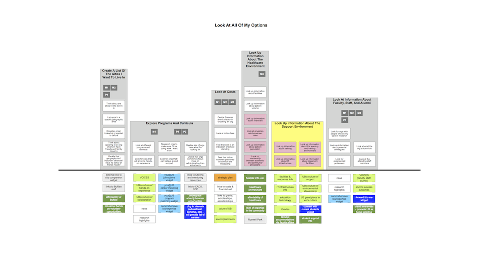
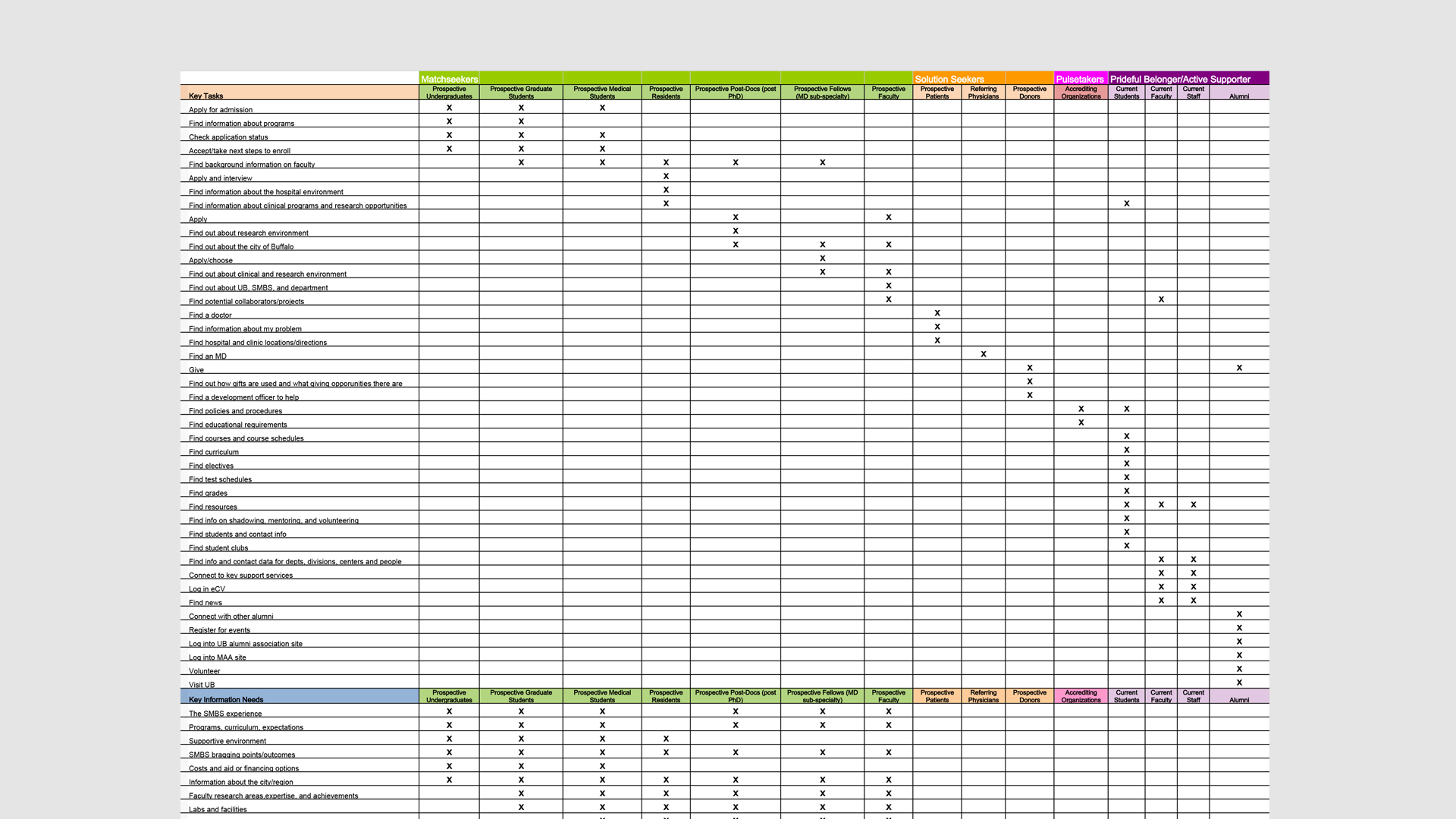
Under the tutorship of Indi Young, a pioneer in ethnographic research applied to digital communication, I took part in training to conduct and transcribe 50 non-directed interviews of people from various backgrounds. The content of which we combed to obtain a data set on key user needs and tasks. This formed the basis of our mental models.
Information architecture
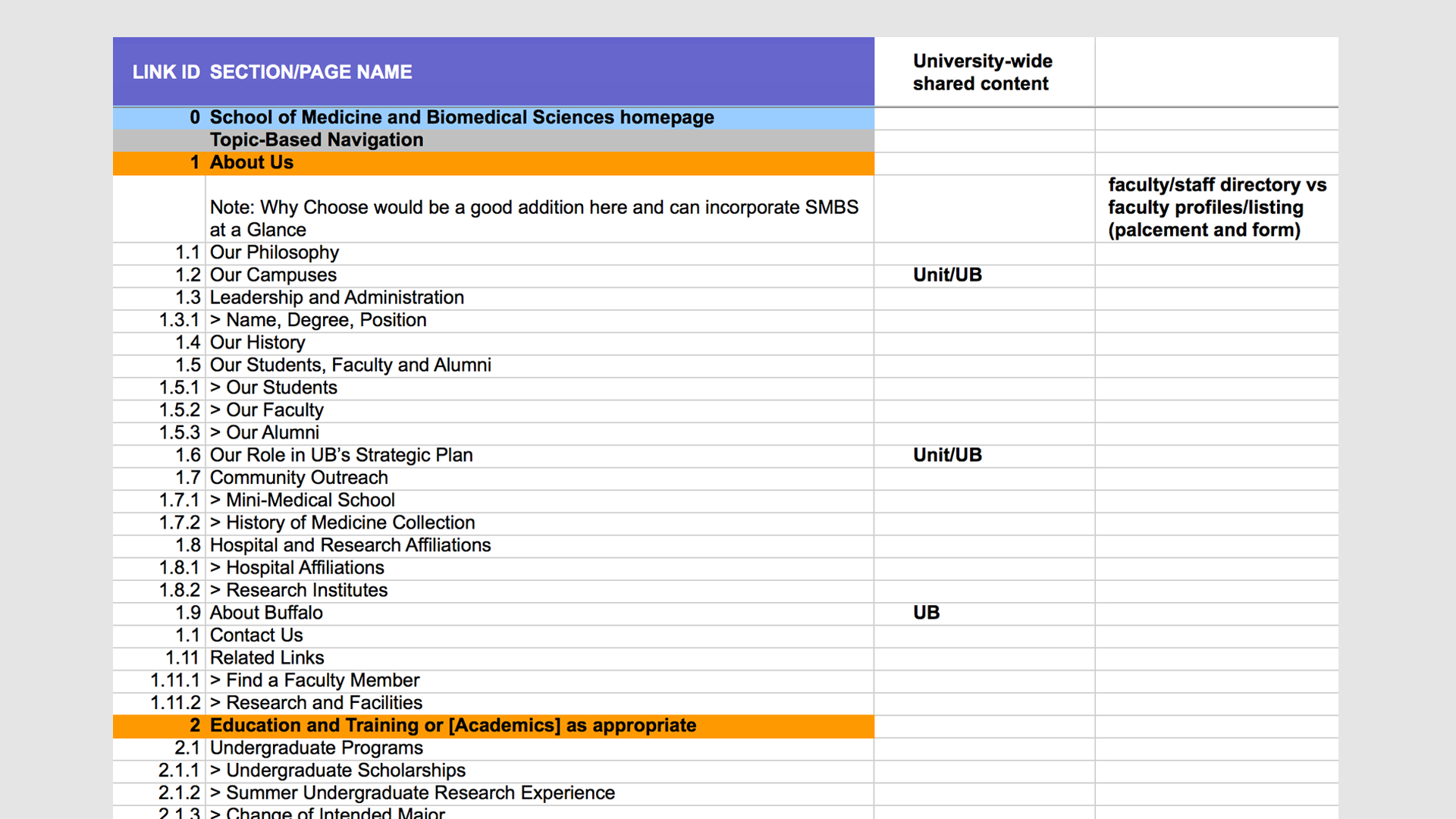
With the existing content cleaned up in the audit stage, and the needed content identified in the gaps of the mental models, the next stage of the process was to outline all of the content via the Information Architecture.
Content strategy
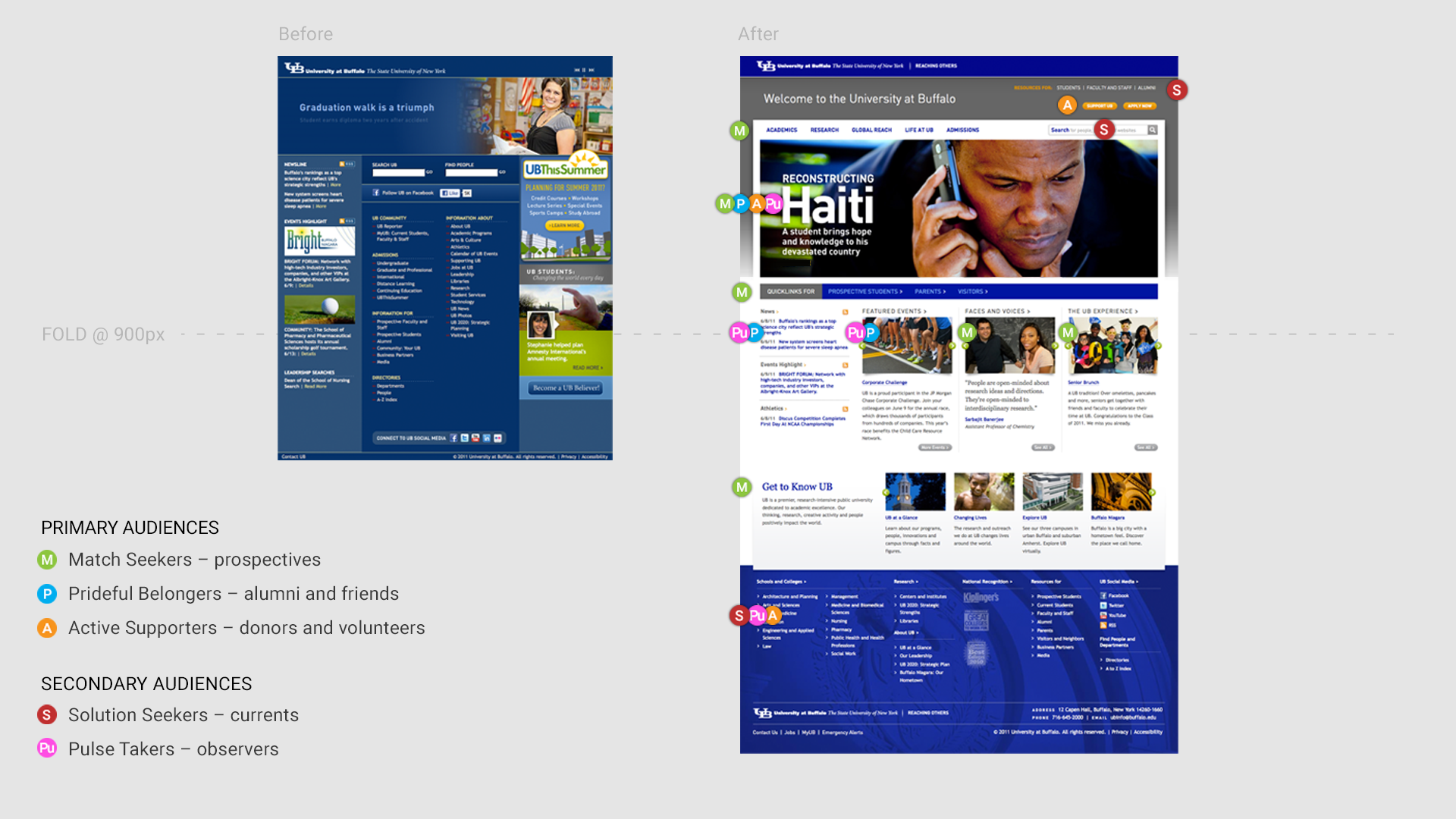
Using the information synthesized from the mental models and structured by the information architecture, we then got content authors and subject matter experts thinking about their site’s content in terms of their audiences. While these segmentations act as a guide to behavior and context, they are not exclusive. In other words, you’ll find an audience segment that may exhibit the behavior of a Match Seeker, but that acts as a Pulse Taker at certain times of the year. The content and UI needs to accommodate for these shifts.
UB’s primary audiences*
Match Seekers
Individuals who are evaluating UB or a working relationship within UB to see if it’s the “right fit,” including prospective students and faculty members.
Prideful Belongers
People who feel a special bond with UB or your department and are looking to connect or reconnect, like alumni, current students, faculty and staff.
Active Supporters
Those who are looking for opportunities to or currently support UB’s success through volunteering, advocacy, leadership, and financial support.
*Secondary audiences included Pulse Takers and Solution Seekers. For more on additional audience segments visit the full documentation site.
Documentation and Training
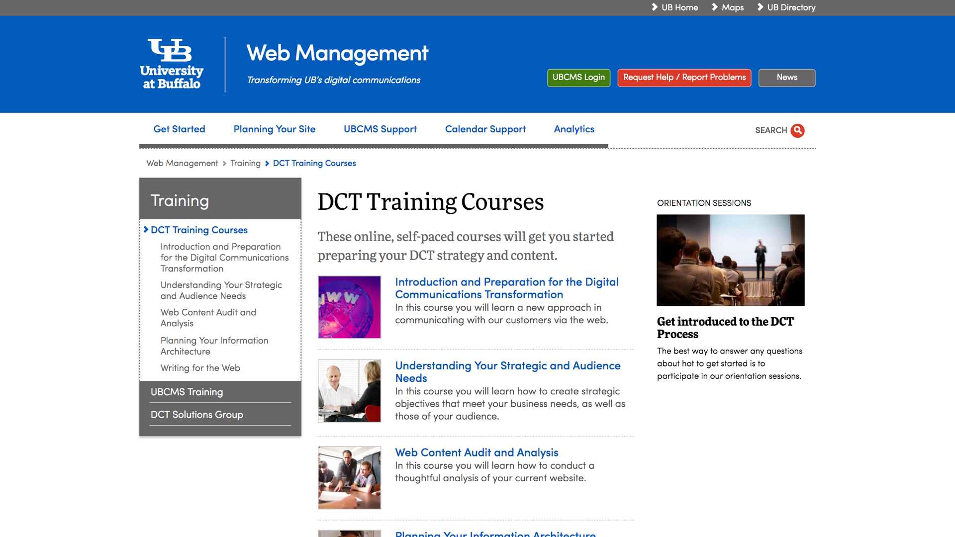
At the conclusion of the research, we compiled our findings and got to work on the documentation and training materials that would need to support a successful university-wide effort.
I contributed to much of the training documentation and resource materials on this site, beginning with drafting its initial site architecture and eventually producing and stewarding a significant amount of its content.
I also evangelized the materials – giving talks, leading training classes and scheduling one-on-one guidance for early adopters.
Circling back
A construct for business
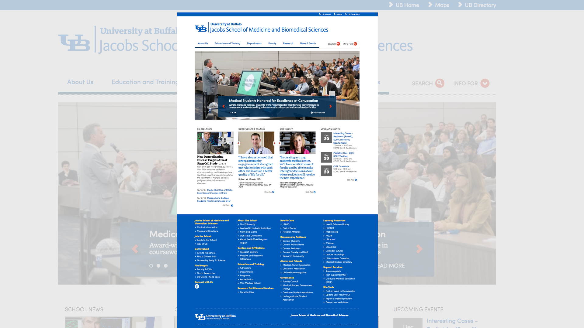
As a basic example of how the business needs (via business guidance) mentioned earlier in this writing went on to inform my role as interface design lead, I want to reference the “Fat Footer” construct. An emerging UI pattern at the time – and now a mainstay of large organizations – this coffee table book of a structure was a lifesaver in terms of satisfying the institutional politics that often get in the way of user needs.
By providing this below-the-fold area for items like funding links and organizational bloat, the user was always presented with the most important content first as determined by the research – all while meeting stakeholder expectations.
Audience-driven page layout
To demonstrate the targeting of the primary audience segments derived from the mental model research, here’s a before and after image of the initial redesign of the main university homepage. Apologies for the low fidelity image, these screen grabs don’t age too well…
References
In the above examples, I recreated and simplified the information to (hopefully) make it more digestible. For the original examples and templates, see the following references:
