CASE STUDY (IN PROGRESS)
User Synthesis
A user research project that (inadvertently) helped identify the need for operational change
Background
I initially didn’t include this in my case studies because the project stalled out, but I realized there was still a lot of value that could come from talking about the process.
When a former employer wanted to take a deeper look at their users’ behaviors, they made a great decision to support the UX Team in conducting interviews for qualitative research.
After reaching out to a partner company to allow us to cull participants from their customer base, we recruited study participants via promos on the partner’s website and email newsletters. Once these were scheduled the interviews were conducted and recorded.
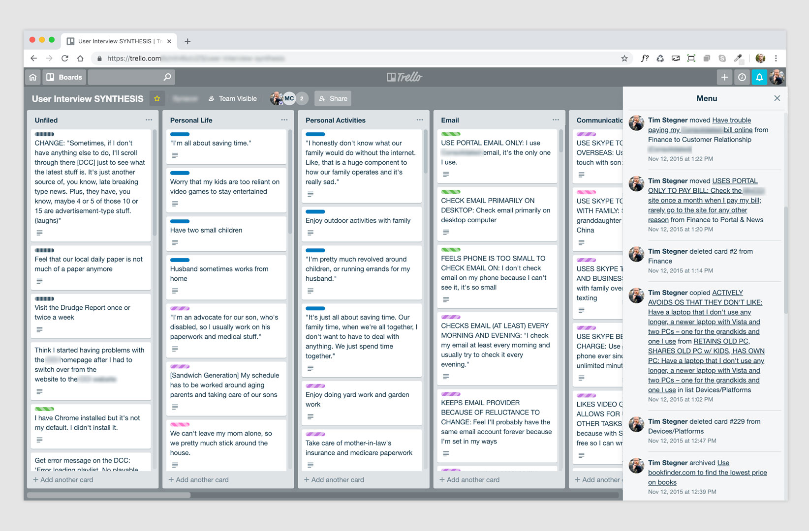
Once the interviews were complete, we set out transcribing and combing the data for tasks, eventually synthesizing the tasks into themes using Trello to easily drag, drop, label and color code (pictured above) the information.
It was at this stage of the process that the user research was put on hold. It was a total bummer, but the company had a big opportunity connected to immediate cash dollars, and all resources shifted to supporting that project.
Dealing with uncertainty? Take a look inside.
With the shift in priority and resourcing, another bump in the road came when our sole, dedicated UX Researcher left the company. With all UX/UI resources now focused on this one client and the loss of a key team member we realized this research wasn’t going to be utilized to its fullest potential any time soon.
But in the disarray that often accompanies these pivots, we were able to observe many teams throughout the company experiencing frustrations of their own. So, we used our UX training and design thinking to look inward and see how this moment of organizational flux could be used to improve operational processes. Basically, how could we come out of this leaner, stronger and get our focus back to the research?
When in doubt, ask questions
By asking internal teams about their experiences we learned that:
- the engineering teams felt overwhelmed
- they felt overwhelmed because:
- new features were being prioritized over tech debt; this prioritization had a cascading effect on quality assurance and testing
- shifting priorities and changes in org structure caused them to be shuffled around to various teams
- various teams had various frameworks and codebases which made transition more time consuming and confusing
Solutions
So, while priorities shifted to one client, the UX and Product Teams resolved to take the opportunity to:
- Formulate a universal design system
- Consolidate frameworks (get engineers using similar frameworks, codebases)
- All new features and rewrites would be coded using modular components (that worked across products)
- And, in one case, folding in the feature set of a product that wasn’t getting enough attention as a standalone product
None of this could have happened without buy-in from engineering and product leadership, but by partnering with devs and other like-minded voices, the UX Team was able to formulate and present a plan that meant speed and efficiency – which ultimately spoke to, and reinforced, the goals and values of the company.
Operational outcomes
As the various elements of the plan were implemented and integrated into team sprints and roadmaps, we saw:
- Increased engineering velocity
- Decreased time spent onboarding new devs / scaling up teams
- Decreased time on management of codebases and documentation
- Decreased time spent on unit testing
All this to essentially get time back to focus on the initial user research.
Yeah, so what about that research…
Right, so this all started with a user research initiative getting sidelined due to limited resources, but by rethinking how we were working as a company, not only were we able to see operational benefits, but we were able to win back time to not only analyze the research, but also use the findings to conduct usability testing, formulate personas, conduct A/B tests – resulting in increased, engagement, user confidence and even time to explore new models.
Easy wins
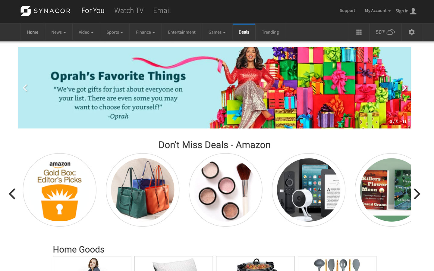
Shopping channel
The research showed that people were busy and tight on cash but would take the time to look at deals. With this insight, we created both homepage shopping promotions and landing pages which were monetized via rev share by partnering with companies such as Amazon, StackCommerce and eBay. These shopping/deals pages now account for a significant percentage of overall revenue.
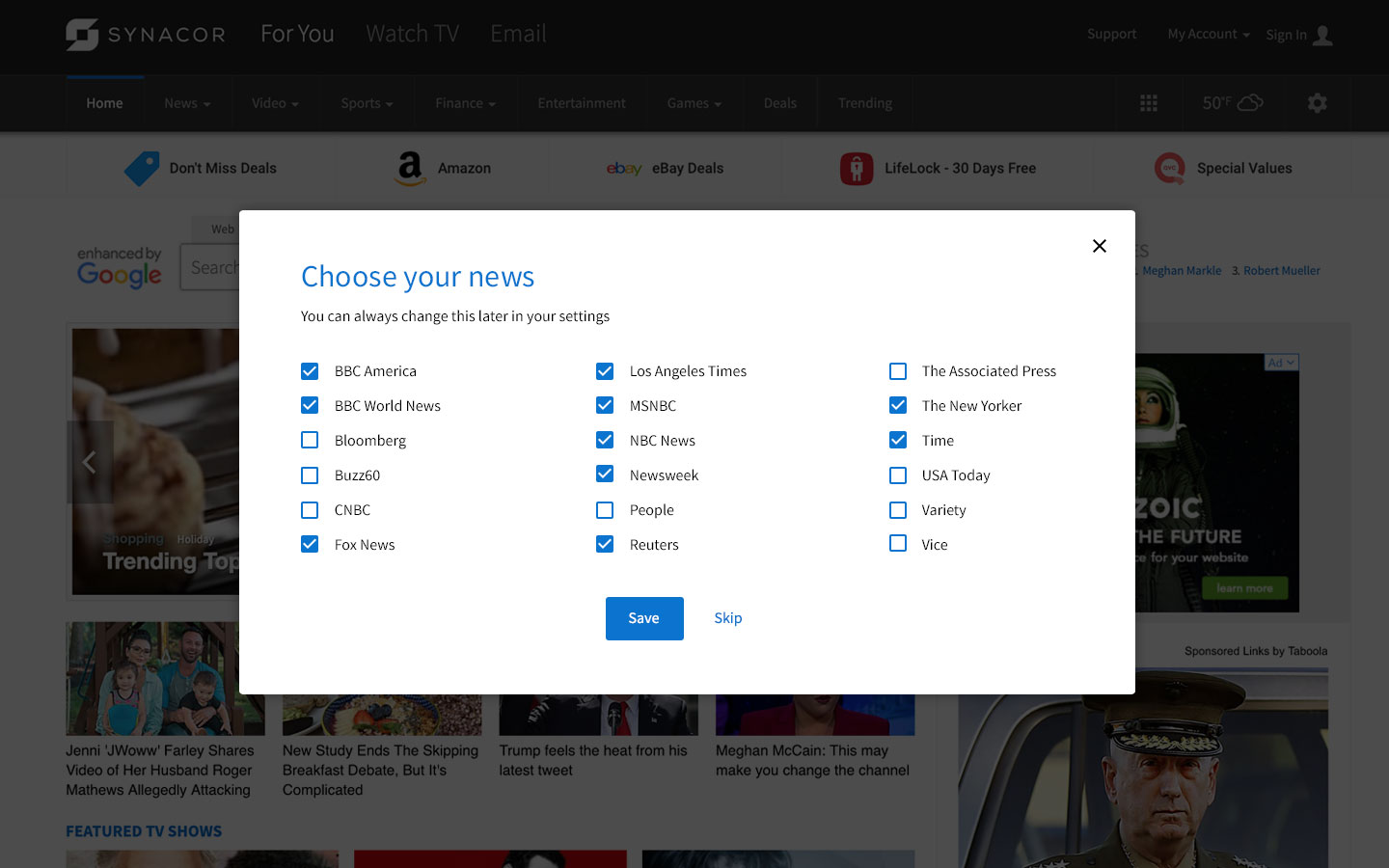
News source personalization
Users were very aware of news sources and many were distrustful of the default news we had initially been offering. Although, passive personalization had been built into the product, that method didn’t work unless the users engaged. To resolve this, a simple screen was added to both the onboarding flow (for new users) and a modal pop-up for existing users. This gave users a sense of control of the content while also informing them of the options.
Adjusting our video/watch content
The research also told us that people found value in video content. The main pain point though was that we had been funneling them through a separate video product that required them to authenticate for much of the content based on provider. This was a situation where we were really trying to force the user into that product in order to up-sell. That model was failing, but by removing the authentication layer and making available video content that didn’t require any, we were not only able to increase engagement on the site (page views and time on site) but we had enough of a revenue bump to sunset the separate video product and win back resources to support initiatives that users really wanted.
Deeper exploration
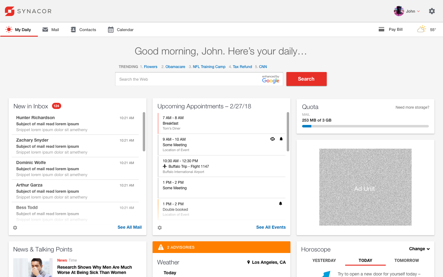
My Daily – an alternative model
Another valuable exploration that came out of this was the My Daily experience. Because both the qualitative and quantitative data pointed to an overall disregard of the current experience of accessing email via a news portal page (à la Yahoo). I wanted to explore an alternate approach to email access that still focused on additional content for monetization. This model would use motivational strategies to:
- introduce the opportunity for small user habits to form which lead the users to monetizable content rather than forcing it on them
- these habits represent intentional/natural clicks to content (implying genuine user interest), yielding higher cost per impression (CPI)
