CASE STUDY
My Daily
Breathing new life into a withering revenue model – through motivation
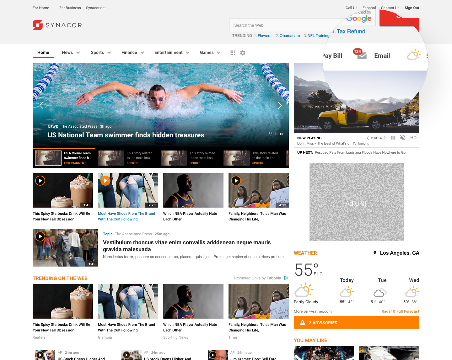
Often times access to email has been monetized using a model popularized by sites such as Yahoo which puts a landing page in front of email. This “Start Page” or “Portal” is basically a place for companies to monetize content through ad impressions and searches.
The core pitch for Start Pages is that they will “increase engagement by delivering relevant content, services, and promotions to your customers.” But the truth, according to the data, is that almost all users are clicking away from this content, as quickly as possible, to do what they really want which is to check their email. Over the years, this model has seen decreased engagement even though companies are employing all sorts of attention grabbing tactics to get users to engage.
In this case study I wanted to illustrate an alternative.
The current user flow

The current experience – Start Page
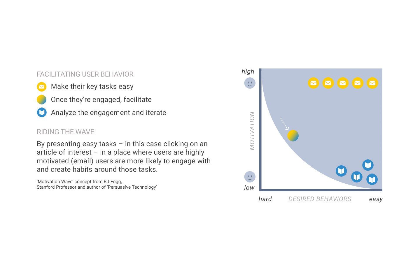
The alternative – using motivation to influence behavior
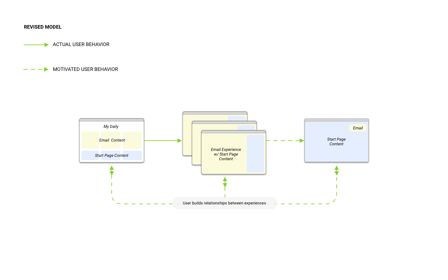
Inspired by B.J. Fogg’s Motivation Wave behavior model, I wanted to integrate desired behaviors in the environment where the user is most motivated. By presenting Start Page content in a place the user wants to be, the hypothesis is that the user not only engages, but also that their affinity toward that engagement increases.
The revised user flow
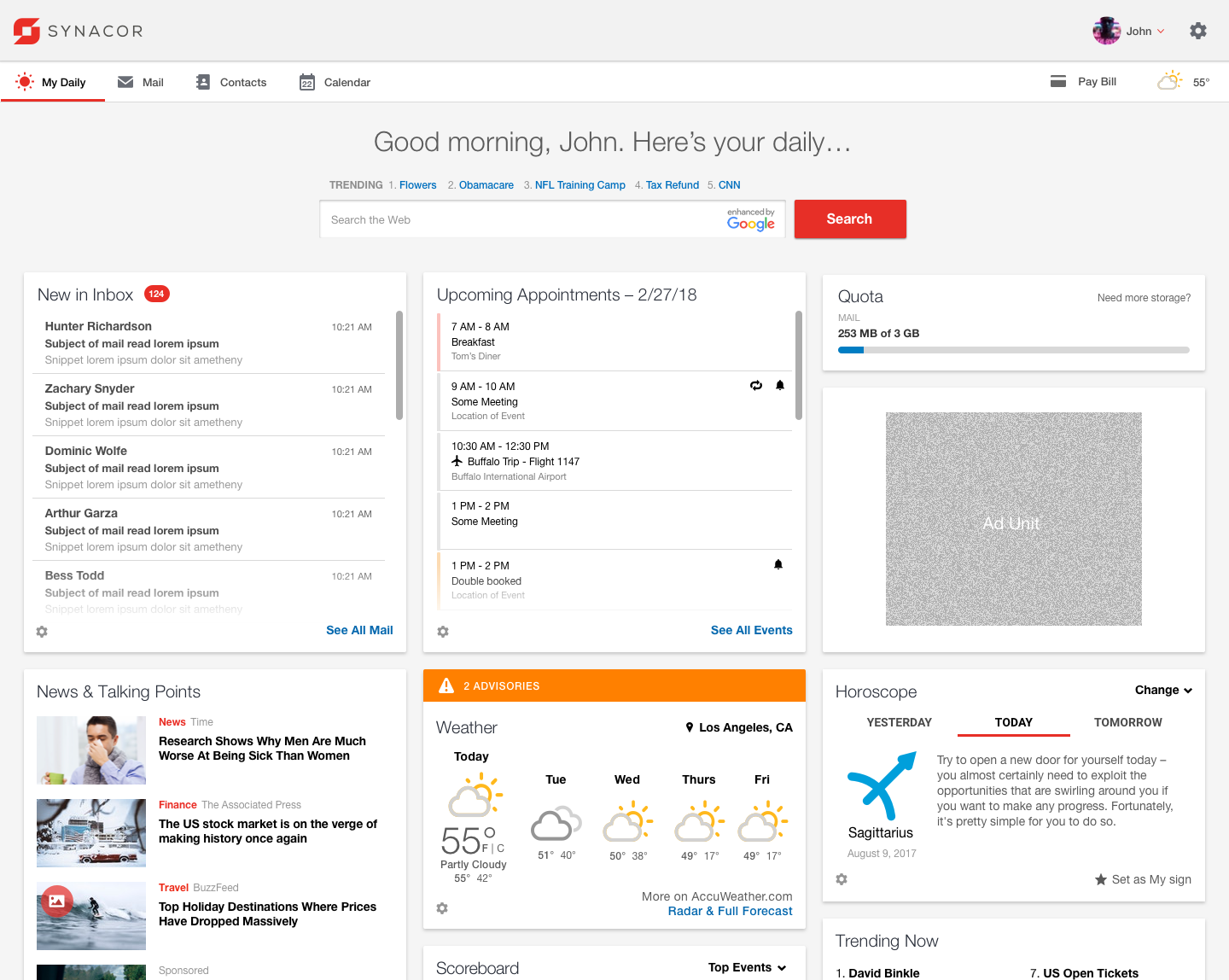
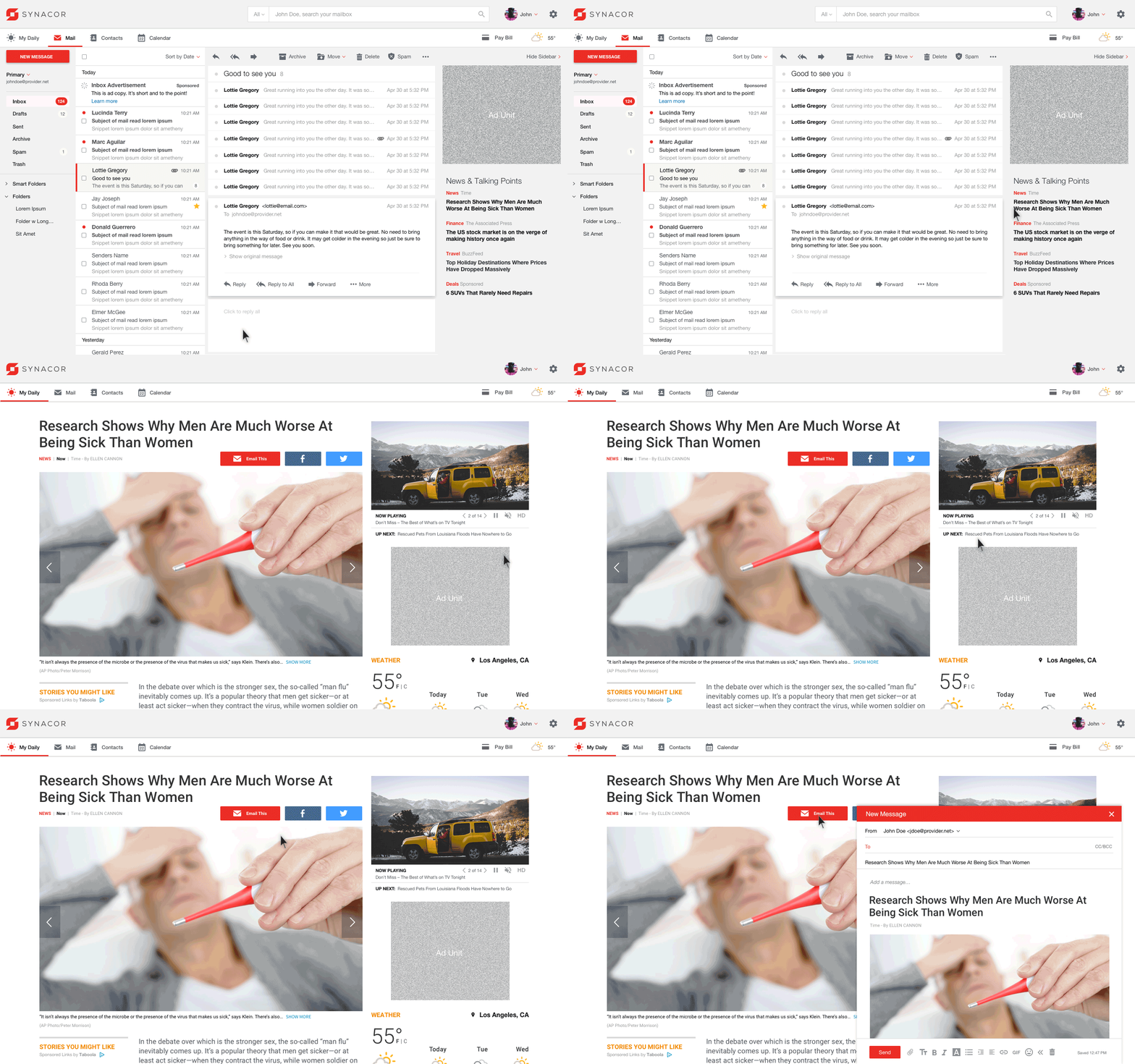
The revised experience – My Daily
By giving the user an at-a-glance dashboard of useful information integrated with content originally on a Start Page, we begin to introduce the “easy habits” from the Motivation Wave model that can be reinforced throughout.
Presenting the desired clicks when and where the user is motivated
Here, Start Page content is added to a sidebar which also features a display ad. Note that the content is framed as “News & Talking Points” in an effort to put news into a conversational context, reducing the cognitive friction from the email environment to an article reading experience. Once a headline is clicked, the user is taken to the article within the current experience. Because the click was intentional, the advertisers will bid more for those eyeballs. Once there, the user can also “natively” share the content via an “Email This” button. Being that the user is already in this communication mindset, this behavior is more likely. Magic.
Related:
