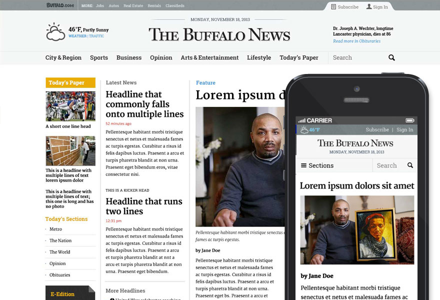

Although not actually proposed to the Buffalo News, more of an exercise, this redesign of the newspaper’s website combines a new information architecture, research from both Pew Internet and the Poynter Institute, and benchmarking of the top news sites. Built on a responsive grid system, and with a new “inline” advertising approach in mind, this design takes the best parts of many sites and combines them into a highly user-focused, easy to learn reading experience.
