Case Studies
As a product designer, I enjoy creating research-driven solutions for users, stakeholders and devs.
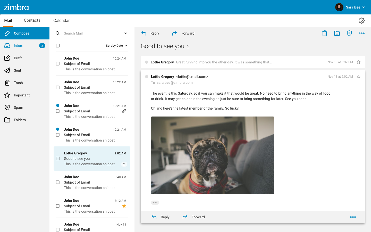
Zimbra Redesign
Modernizing an application for both users and developers
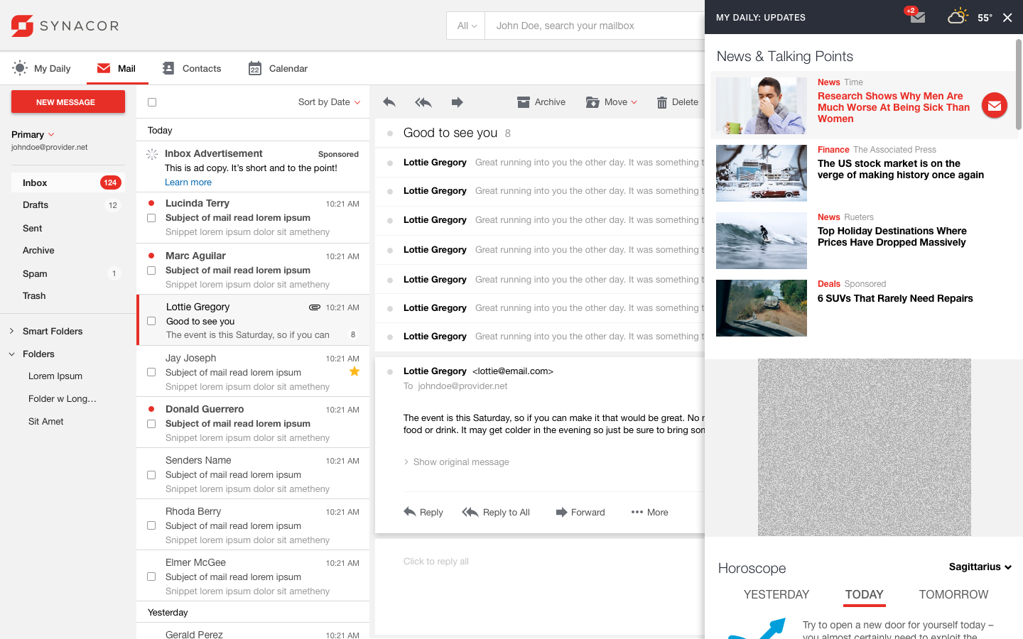
In redesigning Zimbra, I had the opportunity to start with a clean slate, new APIs, new design and new libraries – taking an old difficult to maintain codebase and streamlining it into a modern, responsive application.
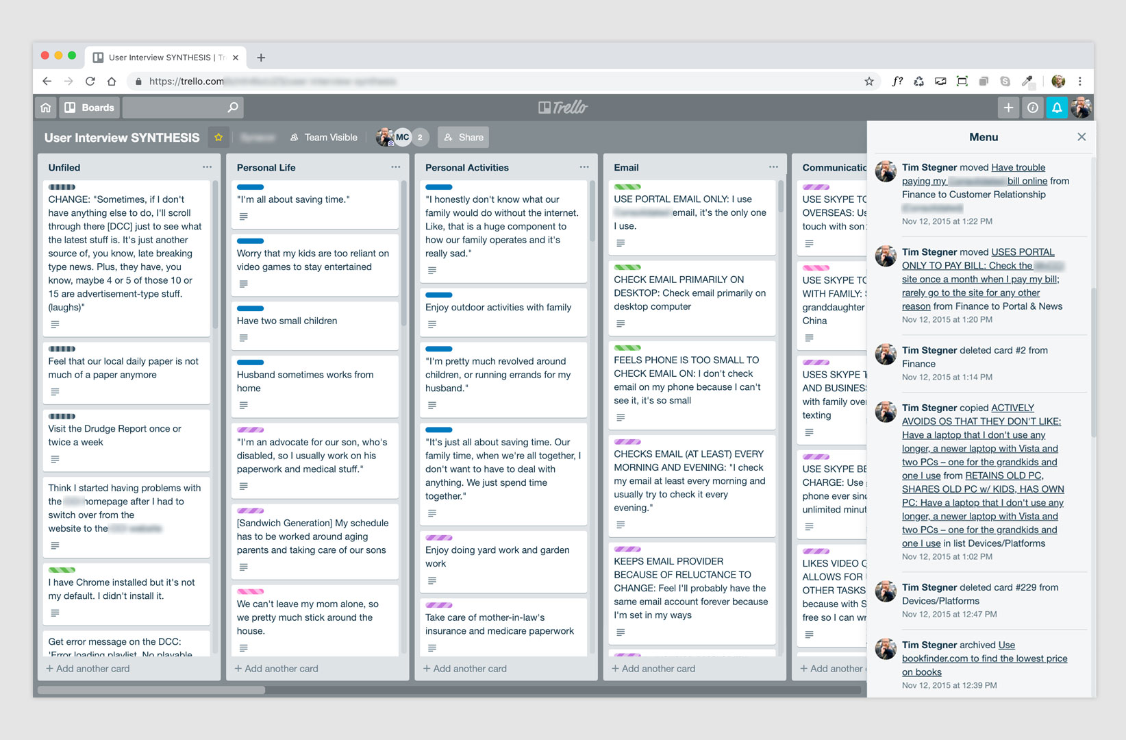
User Synthesis
How user research yielded operational change and improved product
I initially didn’t include this in my portfolio because the project stalled out, but I realized there was still a lot of value that could come from talking about the process.
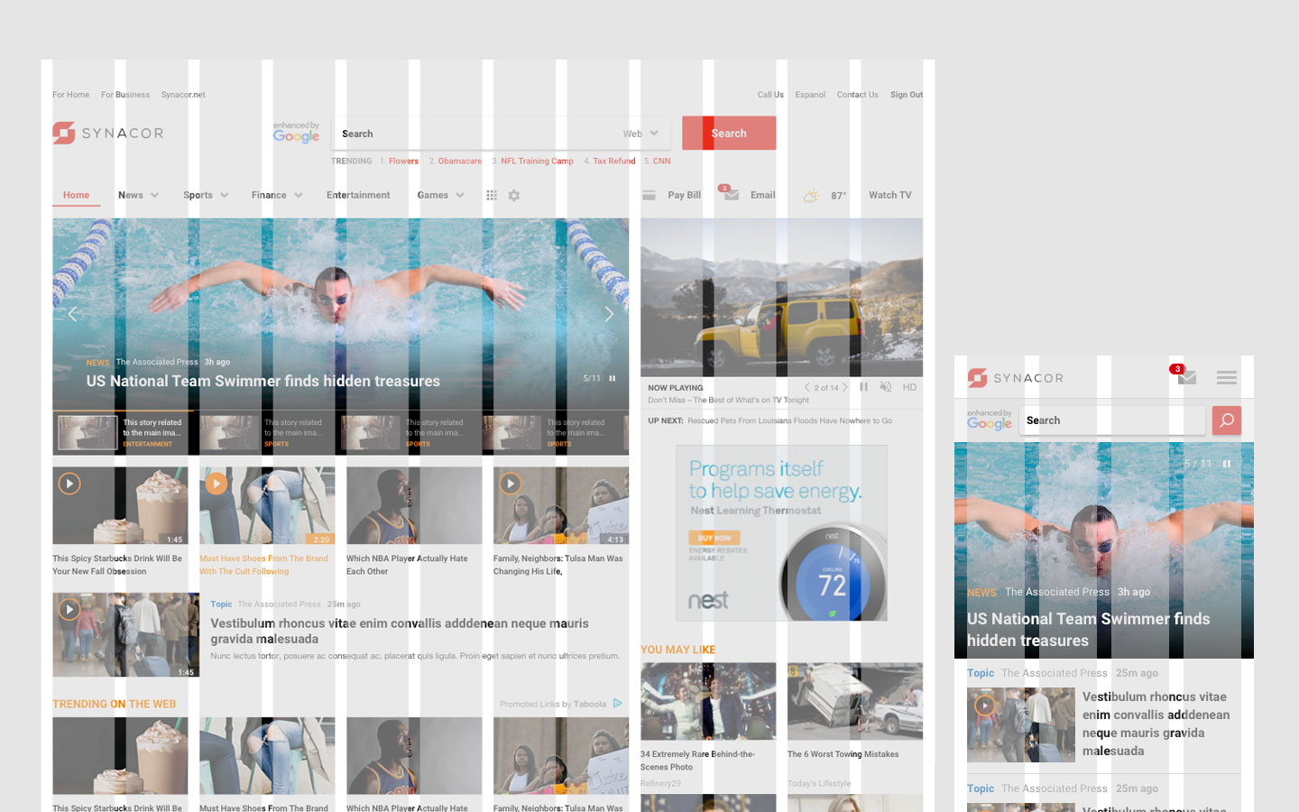
Start Pages
When redesigning a Start experience doesn’t get off to a good one…
As my first project at Synacor, I was excited to go to work, but as development started, I quickly began to identify issues with design integrity. Acting on these observations, I stepped in to more of a product management role to see how I could help.
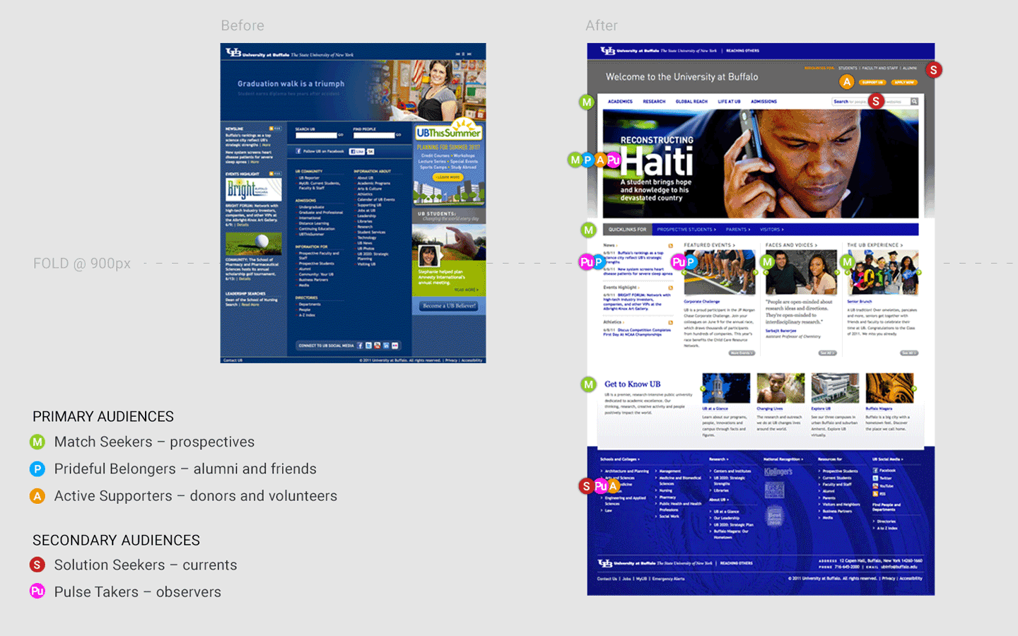
UB’s Research Based Transformation
Transforming a university’s digital communication strategy
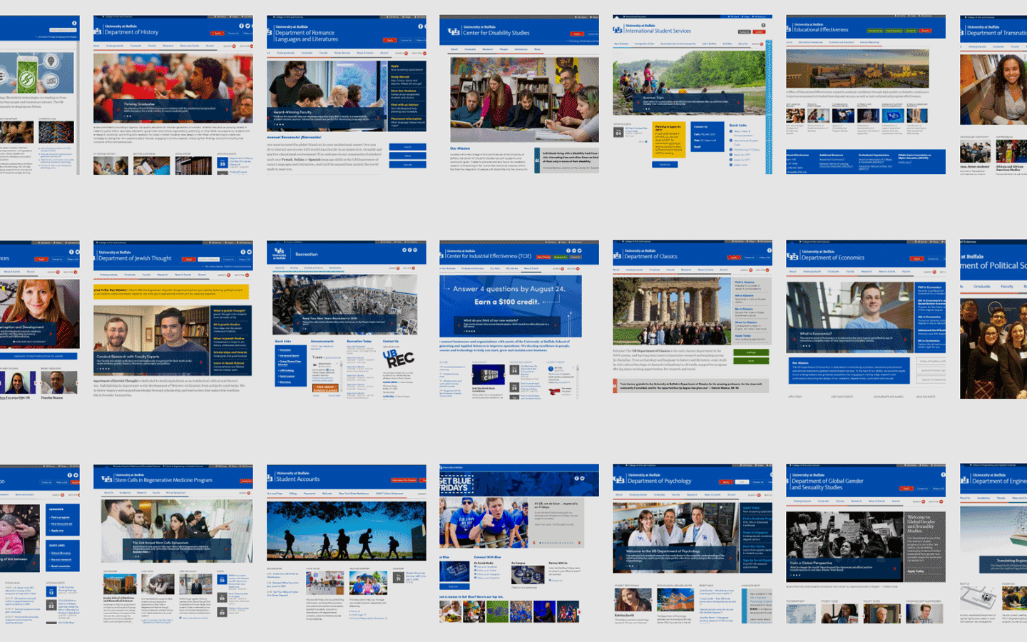
As part of the core team of the University at Buffalo’s Digital Communication Transformation I was involved with defining and instantiating a process that would serve as the model for the university’s online strategy and presence.
University at Buffalo Web Management
Developing an enterprise-wide interface
In 2009, the University at Buffalo (UB) embarked on a total transformation of their web strategy and content management. Leading the UX/UI team on this project, we worked to develop the process and tools to facilitate their 200+ departments.
My Daily
Breathing new life into a withering revenue model – through motivation
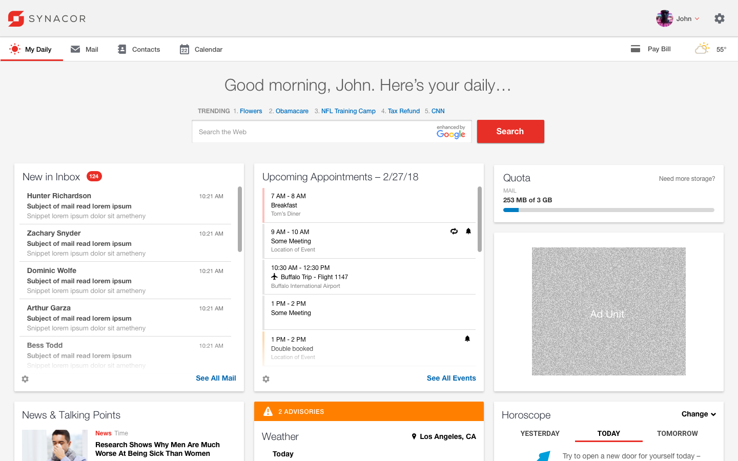
Often times access to email has been monetized using the Yahoo model, which puts a news portal/aggregator in front of the user and forces the user click-through to their email account. In this case study I wanted to illustrate an alternative.
The Disengaged-user Panel
Monetizing a common email behavior
Often times a user opens their email, reads, and possibly responds but then leaves the email open while attending to other things. This model takes advantage of that behavior in order to encourage click-through to other, monetizable content while also showing an ad unit.
Vidbolt
Creating a social video platform
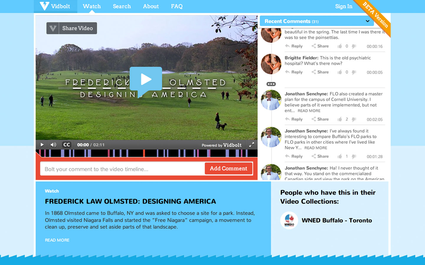
In 2013, a group of friends (among them a stellar mathematician and a computer scientist) and I got together to discuss the possibility of creating a social video startup. Here’s what happened…
